VISUAL PHYSICS ONLINE


  GRAPHICAL ANALYSIS


Ian Cooper

email:  matlabvisulaphysics@gmail.com


Graphs play a very important part in any science.  Graphs show in pictorial form the relationship between two variables and are far superior in the conveyance of information then in numbers in tables. From a graph, you can easily determine the nature of the relationship between variables and whether there are any fluctuations superimposed on the main relationship.


 Ways in which graphs can be used


·       Monitoring the progress of an experiment.

·       Calculation of results: measurement of slope and intercept of a straight line, interpolation, extrapolating, significant points, calibration curves.

·       Comparison with theory.

·       Empirical equations.

·       Reliability


DRAWING GRAPHS


·       Choice of axes

 Consider the functional relationship you want to view or test. For example, the relationship describing the applied force F that stretches a spring by a distance x is given by   F = k x where k is a constant. The graph should have x as the horizontal (X) axis and F as the vertical (Y) axis. The idea of considering the variable as dependent and independent is not useful. You should always thing about the functional relationship between variables to decide on the axes for the graph.


·       Scales and Origin

 Choose scales that are easily subdivided.  The size of the graph should be large enough to convey the desired information. On many occasions, the graph should include the origin.  Mark values at regular intervals on each axis. For large numbers include an appropriate power of 10 in the unit label e.g. x 104 for     10 000, 20 000, 30 000 …


·       Labels and Title

 Label each axis clearly with the name and/or symbol of the quantity plotted and the name of its unit.  You can give each graph a descriptive title or caption, not just repeat the labels for each axis (this is often optional and not always necessary).


·       Plotting

The recommended procedure is to mark each point with a fine pencil dot and to make a circle surrounding it to draw attention to it.  The important pieces of information on a graph of experimental data are the original points -  not any curve which you may fit to them.


If necessary the uncertainty of a measurement may be shown by drawing “lines” through the point where the length of the lines indicate the uncertainty.


CURVE FITTING

In cases where a theoretical relationship is not known it may be appropriate to fit a curve to the experimental data. The curve does not have to pass through all points but should be smooth.  If the reliability of each point has been estimated, any curve that passes within the uncertainty range of every point is a possibility.  If the uncertainty of each point is not known or has not been estimated, the scatter of the points about the smooth curve may sometimes be used as an indication of their precision.


Do not arbitrary reject data.  You should have good reasons for ignoring a point that does not seem to fit.  You should be particularly wary about neglecting points near the extremes of the range of observations, because in these regions it may well be that the type of behaviour has begun to change.


Mathematical relationships

From a graph, it is sometimes possible to determine the mathematical relationship between two variables. To do this we first must determine the function that describes the relationship. 


Common functional relationships:

·       y is proportional to x

              y µ x

              y = m x            m is the constant of proportionality (slope)


              The graph corresponds to a straight line passing through the origin (0,0) with slope m.


·       y is inversely proportional to x

              y µ 1 / x

              y = m / x         m is the constant of proportionality


              Plotting y against 1 / x  gives a straight line through the origin (0,0) with slope m.


·       Linear relationship between the variables x and y  

              y = m x + b      m (slope) and b (intercept) are constants

              This is a straight line cutting the Y axis at the point (0, b) and the X axis at    (-b/m, 0).

·       Sinusoidal functions

              y = A sin(k x + f)           A, k, f are constant

              y = A cos(k x + f)


·       Power relationship

              y = A xn                          A, n are constant


·       Exponential type relationships

              y = A ekx                         A, k > 0 are constant

              y = A e-kx

              y = A(1 – e-kx)


Graphical differentiation

To find the derivative of a function, dy/dx, for various values of x, first plot y against x. At each point where the derivative is required, draw a tangent to the curve and measure the slope of the tangent. The slope of the curve at this point gives the value of the derivative.


Graphical integration

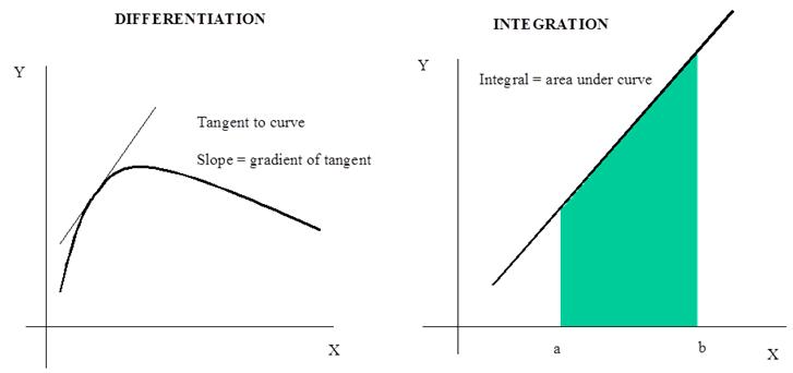
To find the integral of a function, , between x = a and x = b, first plot y against x. Then area under the curve from x = a to x = b equals the value of the integral.


Extrapolation and interpolation

Graphs may be used to obtain values of a quantity that have not been read directly from instruments. A graph can be plotted from the experimental data and new data can be read from the graph. If the new data is read from between measured data points the process is called interpolation. If the new data is read from the graph outsides the limits of the measured data the process is called extrapolation.


Analysis of linear graphs

There is only one shape of curve that is easily recognised unambiguously, the straight line. Hence, if we wish to find out by looking at a graph whether a certain set of data fits a particular kind of mathematical relationship we need to transform the data so that the expected relationship is a straight line. The following example indicates the procedure that should be followed in analysing data that can be fitted with a straight line.


Example 1

 If a mass is hung on the end of a wire, the length of the wire will increase in length:  the greater the mass the greater the extension produced.  The extension should be directly proportional to the applied force up to a point called the elastic limit.  The table below shows a typical set of readings.


force F [N]

0

5

10

20

25

35

40

45

50

extension x [m]

0

0.2

0.8

1.0

1.5

1.6

2.0

2.5

3.2


For the data less than x = 2.5 mm a straight line can be fitted to the data. Therefore, we can conclude that:


     F = k x + b where k is the slope of the line and the intercept b.


The line of best fit is marked as ‘lbf’ and the line of worst fit to the data is marked ‘lwf’.


For the ‘lbf’ and lwf’ : b = 0.

Therefore, x and F are proportional to each other, F = k x.


We can estimate the spring constant, k, from the slope of the line.

    lbf    point 1 (0, 0) and point 2 (2, 38)

     slope = k = (y2 - y1) / (x2 - x1) = (38 - 0) / (2 - 0) = 19  N.mm-1 


    lwf   point 1 (0, 0) and point 2 (2, 36)

   slope = k = (y2 - y1) / (x2 - x1) = (36 - 0) / (2 - 0) = 18  N.mm-1 


The spring constant is

                      k = (19 ± 1) N.mm-1 = (1.9 ±  0.1)´104  N.m-1  


Example 
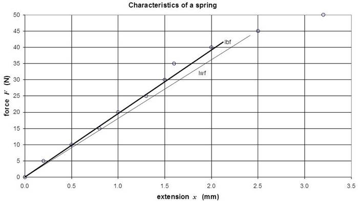
2


View the analysis of the experimental results for a ball rolling down a ramp in the notes on the experiment:


               RECTILINEAR MOTION WITH UNIFORM ACCELERATION